In this article, we will discuss how to plot a line chart in Python with some practical examples.
What is Line Chart?
A line chart is a type of chart that displays data as a series of points(markers) connected by straight lines. It is used to visualize how variable changes over time or to compare two variables. It is a quick and simplest way to visualize the smaller data.line charts are very important the first foundation of visualization. From Matplotlib, we use the plot() function to create a line graph.
Installation of Matplotlib Package
If you don’t have the Matplotlib library installed, then use the below command on the Python Editor for installation
pip install matplotlib
Features of matplotlib plot() function
plt.plot(x-axis,y-axis)    # plot x and y axis using default style
plt.plot(x,y,'r.'          # plot x and y axis using red point markers
plt.title('title name')    # add the title to the line plot
plt.xlabel('x-axis label') # add x-axis label to the plot
plt.ylabel('y-axis label') # add y-axis label to the plot
plt.grid()                 # add grid lines to the plot
plt.show()                 # used to plot the line chart on the screen
Steps to Plot a Line Chart in Python using Matplotlib
Step 1: Import Matplotlib Package
# import library

import matplotlib.pyplot as plt
Step 2: Create the data points for your line chart
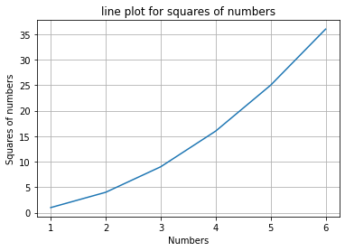
# Create the data points for line diagram
# Create dataset of numbers for x-axis
x= [1,2,3,4,5,6]

# Create dataset of squares of numbers as y-axis
y= [j**2 for j in x]
Step 3: Use the plot() function to create the line chart:
Here is an example of how to create a line using plot() function.
# Plot the line diagram
plt.plot(x,y)
Step 4: Customize the chart as needed with the xlabel(), ylabel(), title(), and grid() functions:
# Style the plot by adding title, labels and grid

plt.title('line plot for squares of numbers')   # Title for the line plot
plt.xlabel('Numbers')  # x-axis name
plt.ylabel('Squares of numbers')   # y-axis name
plt.grid()    # adding grid lines to plot
Step 5: Plot the line chart:
show() function from matplotlib package is used to plot the line chart on the screen.
plt.show()
Complete Python Line Chart Code using matplotlib library as follows:
# import library

import matplotlib.pyplot as plt
import math
# Create the data points for line diagram
# Create dataset of numbers for x-axis
x= [1,2,3,4,5,6]

# Create dataset of squares of numbers as y-axis
y = [j**2 for j in x]

# Plot the line diagram
plt.plot(x,y)

# Style the plot by adding title, labels and grid

plt.title('line plot for squares of numbers')   # Title for the line plot
plt.xlabel('Numbers')  # x-axis name
plt.ylabel('Squares of numbers')   # y-axis name
plt.grid()    # adding grid lines to plot

plt.show()  # to plot the chart on screen
Line Chart Output
Examples of line chart in Python:
Example : How to Create a line chart in Python with dataframes
plot() method is used to generate a line chart from the dataframe.
Step 1: Import Matplotlib Package
# import library

import matplotlib.pyplot as plt
import pandas as pd
Step 2: Create the dataframes for your line chart
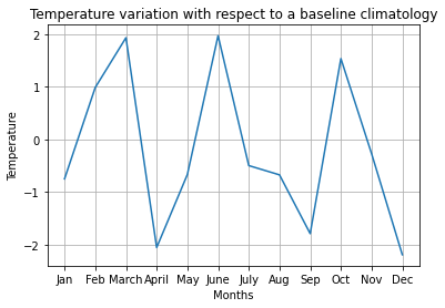
df = pd.DataFrame({'month': ['Jan','Feb','March','April','May','June','July','Aug',
'Sep','Oct','Nov','Dec'],
'temperature': [-0.751,0.985,1.931,-2.056,-0.669,1.969,-0.499,-0.675,-1.792,
1.534,-0.273,-2.193]})

#view the dataframe
print(df)
Step 3: Use the plot() function to create the line chart:
plt.plot(df['month'],df['temperature'])
Step 4: Customize the chart as needed with the xlabel(), ylabel(), title(), and grid() functions:
# Style the plot by adding title, labels and grid
# Title for the line plot
plt.title('Temperature variation with respect to a baseline climatology')

plt.xlabel('Months')  # x-axis name
plt.ylabel('Temperature')   # y-axis name
plt.grid()    # adding grid lines to plot
plt.show()
Step 5: Plot the line chart:
show() function from matplotlib package is used to plot the line chart on the screen.
plt.show()
Complete Python Line Chart Code using dataframes
# import library

import matplotlib.pyplot as plt
import pandas as pd

df = pd.DataFrame({'month': ['Jan','Feb','March','April','May','June','July',
'Aug','Sep','Oct','Nov','Dec'],
                   'temperature': [-0.751,0.985,1.931,-2.056,-0.669,1.969,-0.499,-0.675,-1.792,
1.534,-0.273,-2.193]})

#view the dataframe
print(df)


plt.plot(df['month'],df['temperature'])


# Style the plot by adding title, labels and grid
# Title for the line plot
plt.title('Temperature variation with respect to a baseline climatology')

plt.xlabel('Months')  # x-axis name
plt.ylabel('Temperature')   # y-axis name
plt.grid()    # adding grid lines to plot
plt.show()
Line Chart Output
Summary
Line charts are very informative over time, usually time series. I hope you found the above article on How do you plot a line diagram in Python? with Examples informative and educational.